Tuesday, October 29, 2013
Tuesday, October 22, 2013
Tuesday, October 15, 2013
Visual Literacy: Narrative Treatment
An alarm goes off and a man wakes up. He did not sleep well and looks like hell. He puts on his slippers and a robe and go to the bathroom. He gazes into the mirror, and he thinks about the day he met her. He brushes his teeth, gets dressed, and leaves the house, all while thinking of different stages of their friendship. He waits for the bus to pick him up, and the thoughts keep coming to him, the time they went to a show together, the night they stayed up till 2am just talking. He walks into the office and remembers the day he decided to ask her to be his girlfriend. He gets to his cubicle and sees her on the phone talking to someone. She is smiling and radiant. He remembers going to her place with flowers the night before, and seeing her walk out and get in a car with a new guy. He clicks away at his computer, when the new guy comes into the office. The new guy is picking the girl up for a lunch date. The first man remembers drinking way too much the night before in an attempt to drown his sorrows. Before the girl leaves on her lunch date with the new guy, she stops at the cubicle of the first man to say hi, and then asks "are you alright?". The man responds, after remembering everything again, responds "I'm fine". The end.
Visual Literacy: Photo Essay
So here is my photo essay, a week late...I have to get better at this.
Anyhow, for our photo essay, we decided to explore the concept of style. We met and discussed how we would like to explore it and brainstormed some shots. After that, we split up and took the shots. This led to some of us taking shots of the same subject/theme (the two shoe pictures for example). However, we decided to use them in the photo essay anyways. This presented a challenge regarding the order. We didn't want to put two pictures of the same thing next to each other, or really close to each other.
At this point, I should probably mention that I study conducting (music). In my studies of conducting, I have looked at a lot of scores, and I've noticed a couple of patterns. One example of a way a composer will lay out his score is to pair movements that are alike at opposite ends of the piece. In a cantata, for example, the first movement could be a chorus, followed by a recitative, followed by an aria, followed by a recitative, and ending with another chorus (that would be a very short cantata, but it gets the point across).
Taking inspiration from that, I decided to lay out our photo essay in the same manner. The first and last pictures in the set are each of a person wearing a shoe (I started and ended with that pair because they were the most similar). The second and ninth pictures in the set are of heads; the third and eighth pictures in the set are of stores; the fourth and seventh pictures in the set feature subjects wearing bow ties; and the fifth and sixth pictures in the set highlight cool, blue colors.
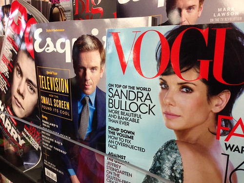
Speaking of the sixth picture, I'm going to analyze that one.

This picture was taken in the AU Bookstore. I admittedly staged the photo, so that there would be three different style magazines featured, rather than a block of the same magazine (as it was presented in the display). The bookstore also has harsh fluorescent lights, which reflected off of the glossy magazine covers (especially on the GQ magazine). However, I was able to take advantage of this, because they almost look like camera flashes (which are a major component to the world of style). If I were to go back and re-take this photo, I would try to make it so the GQ magazine's bottom corner wasn't bent up. I wanted the GQ magazine to be on an angle to make it a little different from the other two magazines, but I couldn't get it to stand up without the of the bottom, and the cashier was giving me funny looks. However, I am generally pleased with this picture and I think it clearly represents the concept of style.
Anyhow, for our photo essay, we decided to explore the concept of style. We met and discussed how we would like to explore it and brainstormed some shots. After that, we split up and took the shots. This led to some of us taking shots of the same subject/theme (the two shoe pictures for example). However, we decided to use them in the photo essay anyways. This presented a challenge regarding the order. We didn't want to put two pictures of the same thing next to each other, or really close to each other.
At this point, I should probably mention that I study conducting (music). In my studies of conducting, I have looked at a lot of scores, and I've noticed a couple of patterns. One example of a way a composer will lay out his score is to pair movements that are alike at opposite ends of the piece. In a cantata, for example, the first movement could be a chorus, followed by a recitative, followed by an aria, followed by a recitative, and ending with another chorus (that would be a very short cantata, but it gets the point across).
Taking inspiration from that, I decided to lay out our photo essay in the same manner. The first and last pictures in the set are each of a person wearing a shoe (I started and ended with that pair because they were the most similar). The second and ninth pictures in the set are of heads; the third and eighth pictures in the set are of stores; the fourth and seventh pictures in the set feature subjects wearing bow ties; and the fifth and sixth pictures in the set highlight cool, blue colors.
Speaking of the sixth picture, I'm going to analyze that one.

This picture was taken in the AU Bookstore. I admittedly staged the photo, so that there would be three different style magazines featured, rather than a block of the same magazine (as it was presented in the display). The bookstore also has harsh fluorescent lights, which reflected off of the glossy magazine covers (especially on the GQ magazine). However, I was able to take advantage of this, because they almost look like camera flashes (which are a major component to the world of style). If I were to go back and re-take this photo, I would try to make it so the GQ magazine's bottom corner wasn't bent up. I wanted the GQ magazine to be on an angle to make it a little different from the other two magazines, but I couldn't get it to stand up without the of the bottom, and the cashier was giving me funny looks. However, I am generally pleased with this picture and I think it clearly represents the concept of style.
Tuesday, October 8, 2013
Visual Literacy: Critical Analysis of Pulitzer Prize Winning Photo
Every year, two photographs win a Pulitzer Prize. Every Pulitzer Prize Winning photograph is currently on display at the Newseum in Washington, DC. A couple of weeks ago, our class had the opportunity to visit the museum to check the exhibit out. We were each told to pick a photograph to write a critical analysis on, and since I am a lover of most sports, i chose "Babe Ruth Bows Out" taken by Nat Fein in 1948.
This picture was taken on June 13, 1948, which was the day that Babe Ruth retired from the New York Yankees. It was also the 25th anniversary of the old Yankee Stadium, a ballpark that Babe Ruth made legendary during his career. There were many photographers staked out to get the best shot of the Babe, but Nat Fein took his shot from behind, showing us not only the number that the Yankees would retire that day, but also the sold-out stadium cheering for Babe Ruth. From this angle, we also have a better look at the hunched over and tired Babe Ruth who was battling with disease at the time (he would die two months later).
Fein also did a great job framing his subject. Babe Ruth is not directly center, but just a little off to the left, showing just how effective the rule of thirds is. He also used a shallow depth of field, the Babe is in crisp, sharp focus, while the ballplayers barely 5 yards away from him are out of focus. All in all, it is not hard to see why this photo won Nat Fein the Pulitzer Prize.
 | |||
| Photo Courtesy of the wonderful people at this blog |
Fein also did a great job framing his subject. Babe Ruth is not directly center, but just a little off to the left, showing just how effective the rule of thirds is. He also used a shallow depth of field, the Babe is in crisp, sharp focus, while the ballplayers barely 5 yards away from him are out of focus. All in all, it is not hard to see why this photo won Nat Fein the Pulitzer Prize.
Saturday, October 5, 2013
Visual Literacy: The 10 Best Pictures in the Photo Journal
The above picture is my favorite picture in the photo journal. I took it in the chapel of the Kay Spiritual Life Center around mid-day. I turned all of the lights off in the chapel, which made the intensity of the light and color coming from the stained-glass windows so much more intense. I also took this shot almost right underneath the windows, which almost gives an illusion of the windows being on the ground. All in all, I was very pleased with the way this shot turned out.
Visual Literacy: Photo Journal Contact Sheet
Here is the contact sheet for the photo journal spanning the topics of light/shadows, the color red, food, doors/windows, and signs.
Tuesday, October 1, 2013
Subscribe to:
Posts (Atom)


