Anyhow, for our photo essay, we decided to explore the concept of style. We met and discussed how we would like to explore it and brainstormed some shots. After that, we split up and took the shots. This led to some of us taking shots of the same subject/theme (the two shoe pictures for example). However, we decided to use them in the photo essay anyways. This presented a challenge regarding the order. We didn't want to put two pictures of the same thing next to each other, or really close to each other.
At this point, I should probably mention that I study conducting (music). In my studies of conducting, I have looked at a lot of scores, and I've noticed a couple of patterns. One example of a way a composer will lay out his score is to pair movements that are alike at opposite ends of the piece. In a cantata, for example, the first movement could be a chorus, followed by a recitative, followed by an aria, followed by a recitative, and ending with another chorus (that would be a very short cantata, but it gets the point across).
Taking inspiration from that, I decided to lay out our photo essay in the same manner. The first and last pictures in the set are each of a person wearing a shoe (I started and ended with that pair because they were the most similar). The second and ninth pictures in the set are of heads; the third and eighth pictures in the set are of stores; the fourth and seventh pictures in the set feature subjects wearing bow ties; and the fifth and sixth pictures in the set highlight cool, blue colors.
Speaking of the sixth picture, I'm going to analyze that one.

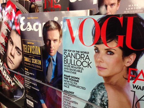
This picture was taken in the AU Bookstore. I admittedly staged the photo, so that there would be three different style magazines featured, rather than a block of the same magazine (as it was presented in the display). The bookstore also has harsh fluorescent lights, which reflected off of the glossy magazine covers (especially on the GQ magazine). However, I was able to take advantage of this, because they almost look like camera flashes (which are a major component to the world of style). If I were to go back and re-take this photo, I would try to make it so the GQ magazine's bottom corner wasn't bent up. I wanted the GQ magazine to be on an angle to make it a little different from the other two magazines, but I couldn't get it to stand up without the of the bottom, and the cashier was giving me funny looks. However, I am generally pleased with this picture and I think it clearly represents the concept of style.

No comments:
Post a Comment