About Me

My photo
My name is Ian. Sometimes I write things.

Monday, September 30, 2013

Visual Literacy: Photo Journal, Light and Shadows

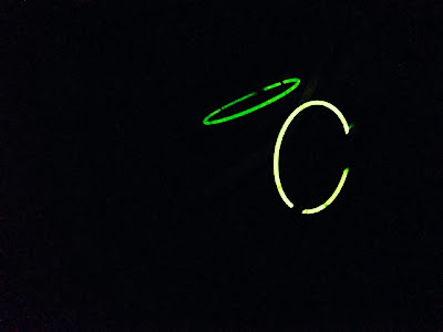
So here is the second entry into my photo journal for Visual Literacy. In this entry, we explore a study of light and shadows...but mostly light. 


Photos taken on my iPhone 5 in and around the DC metro area, Old Rag Mountain, and Rockland Farms in Poolesville, MD.


Thursday, September 26, 2013

Visual Literacy: Photo Journal, The Color Red

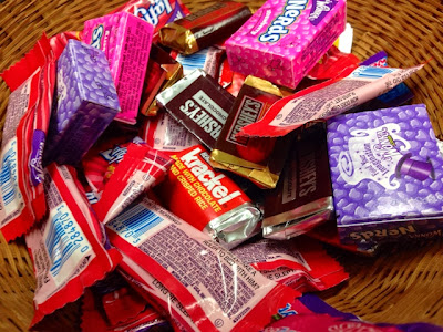
So here's the first round of entries into my photo journal; a study on the color red. 


All photos taken on my iPhone 5 in various locations throughout the Metro DC Area


Monday, September 16, 2013

Visual Literacy: Updated Resume

So I was having some difficulty coming up with a way to update my resume to make it more visually aesthetic.  I tried using serif/non-serif fonts for header/body texts.  I tried doing a double column sort of design, but that didn't leave me with a lot of room to adequately describe my roles in jobs.  So I turned to my classmates for some inspiration, and lo and behold, I found magic with the first blog I turned to, so many thanks to Jon!  I took an image of a treble clef and added it as a watermark to my resume, and I also made the headers a deep red to match my business card.  Now I think it looks more interesting while still maintaining a sense of professionalism.  I know that if I were an employer who saw this resume, I'd give it a second look.

Visual Literacy: Ad Review (a week late)

So this is a week late, but I figure me posting it won't hurt me, so why not?
So this is clearly an ad for Dunkin' Donuts.  In recent years they have been trying to add more meal options besides breakfast.  This ad is a product of that effort, as I do not see a single food/drink item on here that one would normally eat for breakfast.  DD is advertising that this food is for someone with a busy lifestyle, but I think that they have missed the mark.  Only the sandwich appears to be something that can be eaten on the go (maybe if they put a lid on the iced tea, but who eats a personal pan pizza with one hand?)  The font choice, while it matches the DD brand, also doesn't have the connotation of a busy professional, parent, etc.  It's too clunky and feels to playful.  Maybe a sleeker choice would be better.  The same can be said for the colors.  There are a lot of oranges/browns/earthy colors in the food items, and yet the background is also orange.  A blue or cyan would cause the food to pop out more.  All in all, I'm not a fan of this ad.

Tuesday, September 10, 2013

Monday, September 9, 2013

Visual Literacy: Working Resume and Business Card


Above you'll find my resume....isn't it impressive?
Below you'll find my business card...ta da

Tuesday, September 3, 2013

Visual Literacy: A Presentation on Shapes and Forms

So I've been pretty bad about keeping this blog up and running since Lent...oops.  But now I have a reason to keep it going.  My visual literacy class requires I have a blog.  Isn't it great how things work out?

Anyways, here's the first assignment, a presentation on shapes and forms.